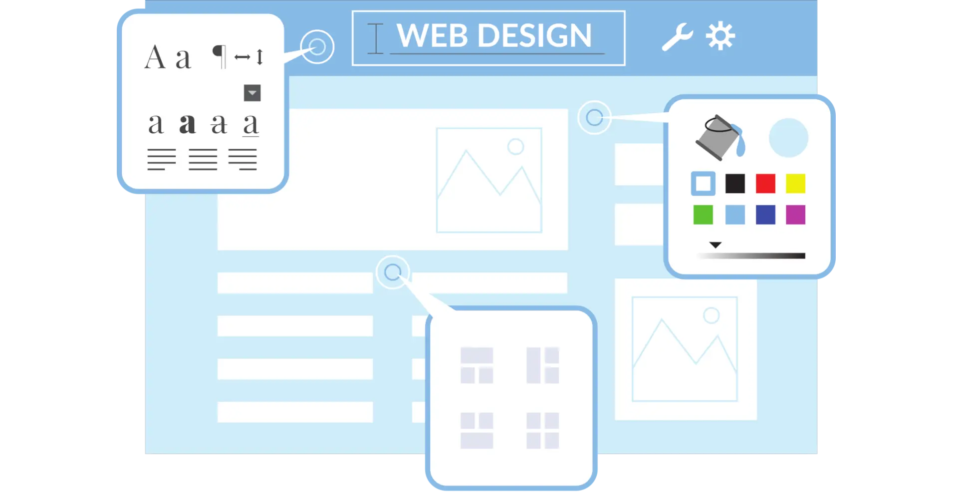
Typography is the backbone of web design, shaping how users perceive and interact with content. Dynamic typography takes this a step further by allowing text to adapt dynamically to user interactions, screen sizes, or preferences. Since its rise around 2016, dynamic typography has transformed web design, leveraging technologies like variable fonts to create responsive, engaging, and accessible experiences. This guide explores what dynamic typography is, why it matters, how to implement it, best practices, real-world examples, and future trends.
What is Dynamic Typography in Web Design?
Dynamic typography means text that adjusts depending on how users interact with it, the type of device being used, or the surrounding conditions. Unlike static typography, which uses fixed font styles, dynamic typography adjusts properties like size, weight, colour, or animation in real-time. For instance, a heading might reduce its weight on smaller screens to maintain legibility or animate subtly to draw attention.
The main idea, as explained by Jason Pamental (Web Typography News), is that the size and layout of text should adjust based on the screen size. This ensures that text remains readable and visually appealing across devices, from smartphones to desktops. Key components include:
- Font Customisation: Adjusting weight, width, or slant using variable fonts via CSS font-variation-settings.
- Screen Adaptation: Using viewport units (e.g., vw) and CSS calculations to scale text proportionally.
- User Preferences: Recognising settings like dark mode or high contrast to adjust typography for accessibility.
Why is Dynamic Typography Important?
Dynamic typography is crucial for creating user-friendly, high-performance websites. Here are its key benefits:
- Improved Readability: By adjusting font size, line length (ideally 60-80 characters), and line height (at least 1.5 times font size), dynamic typography ensures comfortable reading across devices (W3C Text Spacing).
- Enhanced Engagement: Interactive elements like kinetic typography or animated text can make websites more engaging. For example, subtle animations can guide users through content, as seen in branding projects (Creative Bloq).
- Better Performance: Variable fonts reduce font file sizes by up to 88% compared to multiple static files, improving load times and reducing HTTP requests (618media).
- Personalisation and Accessibility: Dynamic typography adapts to user preferences, such as darker fonts for nighttime viewing or bolder text for high-contrast modes, enhancing inclusivity (Acodez).
These benefits make dynamic typography a powerful tool for modern web design, balancing aesthetics with functionality.
How Can You Implement Dynamic Typography?
Implementing dynamic typography involves a combination of CSS techniques, modern font technologies, and user-focused design. Here are the main approaches:
Responsive Design with CSS Media Queries
Media queries allow you to adjust typography based on screen size. For example, you can set larger font sizes for desktops and smaller ones for mobile devices to maintain readability.
h1 {
  font-size: 2.5rem;
}
@media (max-width: 600px) {
  h1 {
    font-size: 1.8rem;
  }
}Variable Fonts
Variable fonts are a cornerstone of dynamic typography, allowing real-time adjustments with a single file. They support attributes like weight, width, and slant, controlled via CSS font-variation-settings.
@font-face {
  font-family: 'MyVariableFont';
  src: url('MyVariableFont.woff2') format('woff2-variations');
}
h1 {
  font-family: 'MyVariableFont';
  font-variation-settings: 'wght' 700;
}
@media (max-width: 600px) {
  h1 {
    font-variation-settings: 'wght' 600; /* Lighter weight for smaller screens */
  }
}CSS Calculations
Functions like calc() and clamp() enable fluid typography that scales smoothly. For example:
p {
  font-size: clamp(16px, 2vw + 14px, 18px);
}This means the text size changes based on the screen width but always stays within a set minimum and maximum size.
Animations and Transitions
Subtle animations, like changing font weight on hover or scrolling, can enhance engagement. Use CSS transitions to make animations smooth without distracting or interrupting the user experience.
h2 {
  transition: font-variation-settings 0.3s ease;
}
h2:hover {
  font-variation-settings: 'wght' 800;
}User Preference Detection
Detect user settings like dark mode using media queries or JavaScript APIs like Navigator.userAgent to adjust typography (MDN Navigator).
Tools and Resources
- CSS Font Loading API: Manage font loading with FontFace and FontFaceSet for better performance (MDN CSS Font Loading).
- Dynamic Subsetting: Reduce font file sizes by removing unused glyphs, especially for complex scripts like East Asian typography (Adobe Fonts).
- Testing Tools: Use platforms like BrowserStack to test typography across devices and browsers.
What Are the Best Practices for Dynamic Typography?
To ensure dynamic typography enhances rather than hinders the user experience, follow these best practices:
- Maintain Consistency: Use a consistent typographic hierarchy (e.g., headings, subheadings, body text) to guide users effectively. Avoid drastic style changes that disrupt the visual flow.
- Prioritize Readability: Ensure text is legible with a minimum font size of 16px, sufficient contrast, and optimal line lengths (60-80 characters) (W3C Text Spacing).
- Ensure Accessibility: Support screen readers, provide high-contrast options, and allow users to adjust font sizes. Test with tools like WAVE to ensure compliance with WCAG standards.
- Test Across Devices: Verify that typography adapts correctly on various devices, browsers, and screen sizes. Use responsive design testing tools to catch inconsistencies.
- Use Moderation: Avoid overusing animations or complex transitions, as they can distract users or slow down the site. Focus on subtle, purposeful changes (OneBaboon).
- Optimise Performance: Use WOFF2 for 30% better compression, implement font-display: swap, and preload critical fonts to minimise layout shifts (Web.dev).
What Does the Future Hold for Dynamic Typography?
The future of dynamic typography is bright, with emerging technologies and trends shaping its evolution:
- AI and Machine Learning: AI can analyse user behaviour to adjust typography in real-time, such as increasing font size for users with slower reading speeds or adapting contrast based on ambient light.
- Advanced Variable Fonts: As variable fonts evolve, designers will gain more control over attributes like slant, optical size, or even custom axes, enabling more nuanced designs (618media).
- Increased Interactivity: Typography will become more responsive to user inputs, such as hover or click events, creating highly interactive web experiences.
- Integration with Multimedia: Dynamic typography will integrate seamlessly with images, videos, and other elements, creating cohesive and immersive designs.
As web design continues to prioritise user experience, dynamic typography will play a central role in creating adaptive, engaging, and accessible websites.
Conclusion
Dynamic typography is a transformative tool in web design, enabling text to adapt to users’ needs and contexts. By leveraging techniques like variable fonts, CSS calculations, and animations, designers can create websites that are visually stunning, highly functional, and accessible. Following best practices ensures that typography enhances rather than hinders the user experience, while real-world examples like The New York Times and Apple demonstrate its potential. As technologies like AI and advanced variable fonts emerge, dynamic typography will continue to evolve, offering exciting opportunities for designers and developers.
Experiment with dynamic typography in your projects using tools like variable fonts and CSS media queries. Test across devices, prioritise accessibility, and let your creativity shine. Web design is ever-evolving, and typography will play a key role in shaping it.